
For my acrylic painting class at Rum River Art Center, we’re creating a painting over several sessions, from the beginnings of a color tint/background to the final stage, where we’ll add details to complete the painting. Most of us chose larger canvases than our paintings from the first classes that I wrote about last time; mine is 18″ x 20″.
When I told my father about the painting class, he said he didn’t think he’d have the patience. I think that’s true of most of us — we expect instant gratification in so many areas of our lives (we want immediate responses to texts, instant information at our fingertips, and popcorn takes only 2.5 minutes to make). While working on our paintings, we want them to “look like something,” or be instantly beautiful.
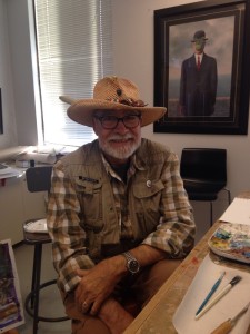
It doesn’t help, perhaps, that our very experienced instructor, Paul Boecher, can conjure a painting on a scrap of canvas with a few deft strokes — and voila! With rapid brushstrokes of one or two colors we can see woods — trees and a stream or path meandering through it.
But when we work on our paintings, we’re learning how to build from the ground up. First, creating the overall color tint of the canvas, followed by general shapes and values of light and dark. From there, we begin to add other colors, perhaps complementary shades, in stages.
Paul asked us to find a photograph or painting we’d like to use as inspiration. I found a couple of Cezanne paintings that I really like: Mont Sainte-Victoire, and a painting of trees:
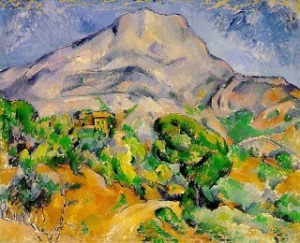

I love Cezanne’s abstraction — there’s a clear idea what he’s painting, but he’s not interested in realistic detail. There’s an interplay of areas of color and shapes that I find fascinating.
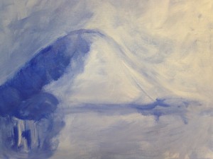
As with my previous painting, I began painting a blue base color, mixed with white gesso. I tried to create a shape like Cezanne’s mountain (though it resembles Mt. Fuji more than Mont Sainte-Victoire, perhaps because I tried painting Mt. Fuji when I used watercolor for a previous blog?).


The source of light is the upper right corner, and there’ll be trees in the foreground (lower left). The horizon line is the lower third of the painting.
Paul reminded me that my darks weren’t nearly dark enough, so I added darker blue to areas where I knew it should be — the side of the mountain away from the light source, and where the trees would go. Overall I just played with the brush, letting myself be pretty loose and free in applying the paint, since I knew this was just the beginning.

Then I felt I was being too literal about the trees, so I “scumbled” over it with more paint (Paul’s ‘technical term’ for a movement of the brush, which is sort of just messing about with it).

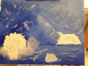
At the next class, Paul taught us how to add texture, using gesso and gel medium (which I was familiar with from explorations with collage). He asked us to play with those materials on a small board to get familiar with creating texture that we could either paint over or use mixed with paint on our larger works. The gel medium would dry clear, he explained, while gesso would dry white (unless we added paint).

Paul showed us a painting he made with wonderful texture effects:

Then we were to use gesso and/or gel medium to add texture to our paintings. At first I applied a huge amount of the stuff, as I love paintings with surface texture:

When Paul stopped by, I said, “I feel like I used too much.” He said, “Yep,” then wiped some of it off with paper towel. He also reminded me that, as with any one color in our paintings, if we use texture in a few areas, we should use a bit all over the painting, to create unity. So I brushed on bits of the gesso in different areas, as well as some of the gel medium around the light source area of the painting (upper right).
That is one of things that surprises me about the painting process — that you should apply bits of color used in any one part of the painting throughout the work. So, unlike a child’s painting, perhaps, the grass is not just green and the sky is not just blue, and the trees not the only area with brown, to avoid creating blocks of monochromatic (one-color) shapes. There should be bits of green everywhere, blue everywhere, brown everywhere. It seems counter-intuitive, but if you examine paintings that are really accomplished, you notice all sorts of colors mixed within what you may think should only be one color. The sea or the sky might contain not just blue, but also green, violet, grey, yellow, even red — and not just at sunrise or sunset.
Now I needed to add a secondary color to my painting, something complementary with blue (with some orange/yellow). I used burnt sienna mixed with white gesso and a bit of yellow.

As during much of this many-layered process, often when I move to a new stage I feel like I’m making the painting “worse.” I’m “wrecking” whatever I thought I had going and creating something less pleasing to my eye. Again, I had to remind myself that I’m far from being finished with this painting, and that many colors would be added before the final stages.
I knew that I really wanted to see some green on the painting, as there would be a lot in the trees, the mountain, and the foreground as well (although it resembles water with all the blue, I’m intending for it to be a plain, as in Cezanne’s painting, not a lake or ocean). So I mixed some greens and was pretty free in applying that all over the painting.
One thing that I noticed is that, instead of blending different colors completely on a palette and then applying that new color to the canvas, our instructor takes a dab of this and that color on his brush and then mixes it ON the canvas, AS he’s painting! I’ve tried this, and it’s hard to get used to, so I want to work on it. Avoiding mixing the colors completely before applying on the canvas means that you end up with less monochromatic blobs of color and more of a variation/gradation of colors. The result is much more interesting to the eye. It is also more suggestive of the interplay of light and shadow, or changes in the colors of nature as you observe them.

Although it’s far from the way I want it, I have ideas about shapes, lines and colors I want to add. I want some red in this painting, some yellow, and violet. I want to play with some of the color blocks and planes that Cezanne uses in his paintings, and I want to keep experimenting and learning from doing. I’m glad that we have three more classes to keep working on our paintings, and I’m looking forward to seeing what happens next!

I am so enjoying your posts on your art class with my husband, Paul, as your instructor, you are making progress and are inspiring me to get back to painting again. Sometimes those little baby steps lead to gigantic footprints. Masterpieces often take time and we are a society of instant gratification. It’s hard to slow down and enjoy the ride, but you seem to be learning well.
LikeLiked by 1 person
Thank you so much! I’m really enjoying the process, no matter how the result turns out.
LikeLiked by 1 person
Do you mind if I reblog this?
LikeLike
Not at all! As long as my name’s spelled right haha!
LikeLiked by 1 person
Thanks, Miriam Queensen!
LikeLike
I am glad you are enjoying the learning and experimenting. That is always my favorite thing, the process 🙂
LikeLiked by 1 person
Reblogged this on atimetoshare.me and commented:
Miriam Queensen writes in detail about her learning art from Paul Boecher who is her instructor at Rum River Art Center. I am proud of my husband’s technique for teaching. It takes time to create a masterpiece. He allows his students to loosen up and enjoy the ride. I’m anxious to see the finished product of Miriam’s painting and love her journaling of the process.
LikeLike