How do you know when you’re done?

“Art is never finished, only abandoned.”
Attributed to Leonardo da Vinci

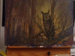
The final acrylic painting class at Rum River Art Center wrapped up a week ago, and I was sad it was over. The students were friendly, creative, and encouraging of each other’s efforts, and the instructor, Paul Boecher, was very skilled and helpful. During the last two classes, I continued to work on my mountain painting a la Paul Cezanne.

Mont Sainte-Victoire by Paul Cezanne

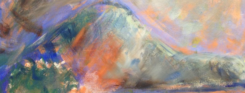
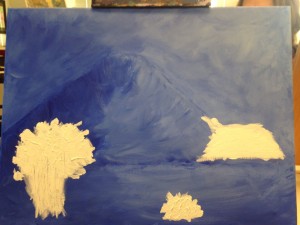
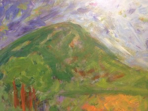
After my previous post, the painting ended up looking like this:

A bit of a happy mess, with lots of different colors, the basic mountain shape and an attempt at some kind of foreground at the left, and a light source at the top right. I played with it quite a bit, adding different colors and frankly just enjoying playing with the paints and paintbrush all over the canvas.

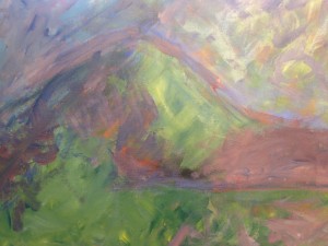
It kept changing every time I worked on it. Sometimes I thought it needed touches of light or dark, sometimes I wanted shades of violet in it, other times more green of different hues. One of my biggest challenges was mixing the exact shades I wanted from the basic paint colors. I couldn’t always achieve what I wanted in my mind. So I kept playing with it.

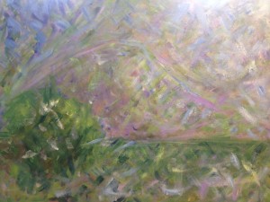
I wanted to alter the shape of the mountain somewhat, and to suggest the idea of a clump of foreground trees in the left, plus fields at the right below the mountain (as opposed to water). I enjoyed watching the painting change and evolve, even though there were times when I wasn’t sure I was improving it, and worried that I was possibly “wrecking” it. Our instructor Paul assured us that we shouldn’t worry about ruining our paintings, as anything could be undone, reworked or painted over.

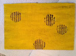
Paul came by and reminded me of a couple of things that Cezanne liked to do: One was to use squares or rectangles of mostly primary colors, sometimes to show the source of light or different shades in the background of a painting, or as a study for the entire painting in terms of planes of color:

Cezanne, Mont Sainte-Victoire

and the other technique Cezanne liked was to add outlines of shapes such as mountains or trees, similar to the way that artists of that era saw used in Japanese woodblock prints —

Print by Katsushika Hokusai (1760-1849)

which were highly influential to Impressionist and post-Impressionist era French painters. So I added those at his direction (and then softened the bright rectangles of color a bit afterwards).

I was really enjoying myself, even while I often felt very unsure of what the final product would look like. I tried to focus on the process and forget about the product as much as possible.

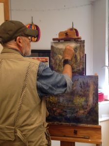
When I returned for the final class, again at Paul’s direction, I worked on softening both sides of the mountain’s outline by painting away from either side of it (outside and inside the line).

Then I wondered what I wanted the foreground trees to look like. Initially I wanted to use this Cezanne painting as inspiration:

But that seemed too daunting. Then I also looked at some great Cezanne pine trees that he often used in his many depictions of Mt. Sainte-Victoire:

This also seemed very challenging. So I went another direction, borrowing loosely from Vincent Van Gogh’s olive trees:

Again, very loosely — I was mostly thinking about his cool wobbly-looking tree trunks when I painted mine.

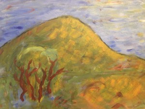
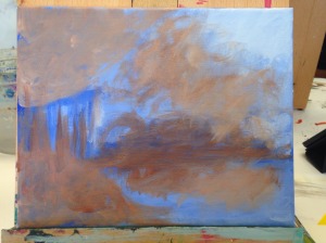
Then I added a thin outline of the overall tree shape, and Paul suggested to add a lighter yellow color behind the outline to make the trees stand out as being closer to the viewer.

From there, I softened those highlights behind the trees and played with more color, adding some reds here and there, and a clump of trees down on the plains beneath the mountains.

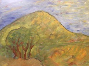
Finally, Paul came over before the end of class and suggested adding spots of brighter yellow to show where the light might be catching on the trees, in the mountain, etc., and then to soften those spots of color by blurring with the brush.

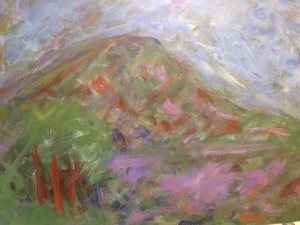
Here’s how it looks fully dry:

Overall, I learned a lot during this process. It took several weeks to get to this “finished” product. Am I happy with it? Not completely. Would I like to keep working on it? Maybe. But I’d also like to take some of what I’ve learned and start something new. I learned a great deal about acrylic painting techniques, and also about myself and my own artistic interests. I have a clear preference for certain kinds of art over others, and I prefer paintings that are less “realistic” — I’m much more interested in the interplay of shapes, colors, with a sense of movement and light. I very much enjoy the process of making art — the sheer fun of playing with colors, paints, and brushes on the canvas.

Happy painting!

Miriam

Work in Progress

For my acrylic painting class at Rum River Art Center, we’re creating a painting over several sessions, from the beginnings of a color tint/background to the final stage, where we’ll add details to complete the painting. Most of us chose larger canvases than our paintings from the first classes that I wrote about last time; mine is 18″ x 20″.

When I told my father about the painting class, he said he didn’t think he’d have the patience. I think that’s true of most of us — we expect instant gratification in so many areas of our lives (we want immediate responses to texts, instant information at our fingertips, and popcorn takes only 2.5 minutes to make). While working on our paintings, we want them to “look like something,” or be instantly beautiful.

It doesn’t help, perhaps, that our very experienced instructor, Paul Boecher, can conjure a painting on a scrap of canvas with a few deft strokes — and voila! With rapid brushstrokes of one or two colors we can see woods — trees and a stream or path meandering through it.

But when we work on our paintings, we’re learning how to build from the ground up. First, creating the overall color tint of the canvas, followed by general shapes and values of light and dark. From there, we begin to add other colors, perhaps complementary shades, in stages.

Paul asked us to find a photograph or painting we’d like to use as inspiration. I found a couple of Cezanne paintings that I really like: Mont Sainte-Victoire, and a painting of trees:


I love Cezanne’s abstraction — there’s a clear idea what he’s painting, but he’s not interested in realistic detail. There’s an interplay of areas of color and shapes that I find fascinating.

As with my previous painting, I began painting a blue base color, mixed with white gesso. I tried to create a shape like Cezanne’s mountain (though it resembles Mt. Fuji more than Mont Sainte-Victoire, perhaps because I tried painting Mt. Fuji when I used watercolor for a previous blog?).

The source of light is the upper right corner, and there’ll be trees in the foreground (lower left). The horizon line is the lower third of the painting.

Paul reminded me that my darks weren’t nearly dark enough, so I added darker blue to areas where I knew it should be — the side of the mountain away from the light source, and where the trees would go. Overall I just played with the brush, letting myself be pretty loose and free in applying the paint, since I knew this was just the beginning.

Then I felt I was being too literal about the trees, so I “scumbled” over it with more paint (Paul’s ‘technical term’ for a movement of the brush, which is sort of just messing about with it).

At the next class, Paul taught us how to add texture, using gesso and gel medium (which I was familiar with from explorations with collage). He asked us to play with those materials on a small board to get familiar with creating texture that we could either paint over or use mixed with paint on our larger works. The gel medium would dry clear, he explained, while gesso would dry white (unless we added paint).

Paul showed us a painting he made with wonderful texture effects:

Then we were to use gesso and/or gel medium to add texture to our paintings. At first I applied a huge amount of the stuff, as I love paintings with surface texture:

When Paul stopped by, I said, “I feel like I used too much.” He said, “Yep,” then wiped some of it off with paper towel. He also reminded me that, as with any one color in our paintings, if we use texture in a few areas, we should use a bit all over the painting, to create unity. So I brushed on bits of the gesso in different areas, as well as some of the gel medium around the light source area of the painting (upper right).

That is one of things that surprises me about the painting process — that you should apply bits of color used in any one part of the painting throughout the work. So, unlike a child’s painting, perhaps, the grass is not just green and the sky is not just blue, and the trees not the only area with brown, to avoid creating blocks of monochromatic (one-color) shapes. There should be bits of green everywhere, blue everywhere, brown everywhere. It seems counter-intuitive, but if you examine paintings that are really accomplished, you notice all sorts of colors mixed within what you may think should only be one color. The sea or the sky might contain not just blue, but also green, violet, grey, yellow, even red — and not just at sunrise or sunset.

Now I needed to add a secondary color to my painting, something complementary with blue (with some orange/yellow). I used burnt sienna mixed with white gesso and a bit of yellow.

As during much of this many-layered process, often when I move to a new stage I feel like I’m making the painting “worse.” I’m “wrecking” whatever I thought I had going and creating something less pleasing to my eye. Again, I had to remind myself that I’m far from being finished with this painting, and that many colors would be added before the final stages.

I knew that I really wanted to see some green on the painting, as there would be a lot in the trees, the mountain, and the foreground as well (although it resembles water with all the blue, I’m intending for it to be a plain, as in Cezanne’s painting, not a lake or ocean). So I mixed some greens and was pretty free in applying that all over the painting.

One thing that I noticed is that, instead of blending different colors completely on a palette and then applying that new color to the canvas, our instructor takes a dab of this and that color on his brush and then mixes it ON the canvas, AS he’s painting! I’ve tried this, and it’s hard to get used to, so I want to work on it. Avoiding mixing the colors completely before applying on the canvas means that you end up with less monochromatic blobs of color and more of a variation/gradation of colors. The result is much more interesting to the eye. It is also more suggestive of the interplay of light and shadow, or changes in the colors of nature as you observe them.

Although it’s far from the way I want it, I have ideas about shapes, lines and colors I want to add. I want some red in this painting, some yellow, and violet. I want to play with some of the color blocks and planes that Cezanne uses in his paintings, and I want to keep experimenting and learning from doing. I’m glad that we have three more classes to keep working on our paintings, and I’m looking forward to seeing what happens next!

Mind the Gap

“All of us who do creative work, we get into it because we have good taste. But there is this gap. For the first couple years you make stuff, it’s just not that good . . . but your taste, the thing that got you into the game, is still killer. And your taste is why your work disappoints you. A lot of people never get past this phase  … We know our work doesn’t have this special thing that we want it to have … And if you are just starting out or you are still in this phase, you gotta know it’s normal and the most important thing you can do is do a lot of work … It is only by going through a volume of work that you will close that gap, and your work will be as good as your ambitions … It’s gonna take a while … You’ve just gotta fight your way through.”
— Ira Glass

That’s how I felt starting my first acrylic painting class at RumRiver Art Center. I’ve had a secret desire to paint for a long time. Fear has kept me from it. (I did dabble in watercolors earlier this year, finding it daunting!) My college minor was art history, and I’ve spent many hours looking at art — mostly paintings — and being fascinated by them. And I knew that whatever I’d try to create would fall far short.

Some of the fascination comes from my desire to understand the painter’s imagination — what made them want to paint THIS? Did their painting live up to their vision? I’m more interested in paintings that are not realistic. While I can admire art that is incredibly detailed and appears more real than a photograph, that is not the art that draws me in.

The paintings that intrigue me leave more to the imagination — abstractions, impressions, approximations, deconstructions of the visual, shown through the filter of the artist’s mind.

Most painters who are great at creating interesting abstractions first mastered their materials and techniques. They do not paint abstractions because they are unable to produce detailed realism, but this is a CHOICE. It’s the artist’s choices that fascinate me.

Our teacher, Paul T. Boecher, told us that he’s been painting since he was 12. He appeared entirely comfortable with his materials, playing with paint and brushes deftly as he explained what he was doing.

He made it look incredibly easy. But that gave us courage. He showed how we could change what we painted if we made a mistake. He demonstrated how to begin a landscape, how to choose a horizon line, and to divide the picture into thirds, horizontally and vertically.

Paul had us begin with one color mixed with white gesso. I chose blue and experimented with differing amounts of gesso on the canvas, choosing a horizon line and trying to imagine a scene. The idea was to create a value study; to develop the varying shades of light and dark that would exist in our painting.

The class began painting with enthusiasm. The students had varying levels of experience, so I felt comfortable knowing I was not the only beginner! Some students used a photograph or other source for inspiration, while others experimented with only a vague idea of what we might create.

The instructor showed us that we could be very free with how our brushes applied the paint (and use much less paint than I expected), and how to hold the brush in different ways while covering the entire canvas with our base color.

All I knew was that I wanted the source of light to be the upper right corner, and the horizon line at the lower third portion. I started to imagine water at the lower right, and that the left might contain trees. The dark area at the top left I imagined as storm clouds. I was not entirely clear on this from the beginning. I mostly enjoyed the sensation of mixing colors and watching what happened while I played with the paint on the surface. It was easy to get caught up in the movement of the brush and forget that I was actually trying to make something!

The second week, we added a second color to our paintings, to let more of the background take shape. The idea was not to add detail, but to provide color contrast, deepen the values where we wanted darkness, and to formulate more of what we were actually painting. I had a vague idea what I was starting to see on the canvas, though I doubted my ability to pull it off the way I wanted.

I started adding a contrasting color to the blue — burnt umber — mixed with gesso.

It seemed like I was making things worse. But I reminded myself that we were still just working on the background, and that paintings need depth and layers of color.

We started to add other colors to our paintings. I tried to create colors I wanted from the three primary colors available — red, yellow and blue — plus white gesso. It’s a lot harder to get just the right hue than I thought. Sometimes I’d make a bit of one color, but would then be unable to duplicate it when I needed a little more. I played with browns for trees, shade, depth; yellow for light and sun; different blues for sky and water. Yellowish greens. The picture kept changing as I experimented, and I didn’t always like it.

Sometimes I got caught up in the sheer fun of swirling the paintbrush around and messing with the colors.

Paul was encouraging to everyone, even if we seemed disheartened by our efforts. He reminded us to get up and step back from our paintings once in a while to be able to see them fresh.

I got up from my tabletop easel for a bit; everyone was busily at work

After this I really needed some greener green for the trees and ground. I had trouble mixing exactly the colors that I wanted. Paul came by and showed me where I could add glimmers of lighter paint to draw the eye — showing where light from the sun might catch, or there might be spaces in the foliage.

Then I wanted to create gray for the impending storm cloud. Paul told me which colors to use, but my ratios were all wrong. I was not happy with the result. By the time it dried, it looked more brown than gray.

By the time I made the version on the right, I’d added more yellow for the sun (probably too much), and managed to cover up the cool swirly yellow lines that I’d liked on the earlier version on the left. I did have more green, but I was not entirely happy with it. I liked the reflection of the hills in the water, but my trees were odd and the overall colors did not please me.

By the time class was nearly over, I felt like I was making the picture worse every time I added more paint.

I reminded myself that I could still add to it, whether at home or the next class. Or simply start anew! Yesterday I worked on it again:

I’m still not delighted with all the colors, and I may tinker some more. But it’s much more pleasing to my eye than it was before. I like the layers, and the sense of movement. I have no desire to make a detailed painting; yes, it’s partly because I doubt my ability to render details with any level of skill. But the truth is, I like paintings where you see the brush, the colors are not necessarily realistic, and what’s interesting is the vision that’s shown you.

Works like this one come to mind (NOT that I’m comparing myself to Paul Cezanne, mind you!) —

Mont Sainte-Victoire by Paul Cezanne c. 1905

What I like are the planes of color, the lines, and the obvious brushwork. You can see brushwork better at a museum than in a photograph, but you get some idea if you enlarge the picture and look closely. This sort of painting fascinates me.

I look forward to further painting adventures this month and next — stay tuned! If you paint, tell me about your painting rewards and challenges.

Miriam

Creating the foundation

I’ve always been fascinated by art using mixed media. When I blogged about paper collage last year (from A Bird by Any Other Name to Juxtaposition of Elements), I launched straight into gluing paper to create pictures, without any planning, without prepping surfaces for the work that would follow. I wanted to get to the fun stuff — creating a jigsaw puzzle of sorts with images and colors that intrigued me.

Now I’m focusing on learning about techniques and materials, with the help of this cool book:

Collage Lab by Bee Shay

The book is divided into easy-to-digest lessons on everything from ways to prepare surfaces (or “substrate,” as it’s called in collaging and painting) to using organic materials and other items. There’s an emphasis on layering, which is something I learned to appreciate during my month dabbling with watercolor paints.

This week I focused on the opening lessons which recommended materials including gesso and matte medium. Gesso has been used in art for centuries, mostly as a primer. In medieval art, it was applied repeatedly in very thin layers to create a paintable surface on wood or canvas. It is a blend of some kind of binder, like glue, with chalk and white pigment, and it absorbs most paints. Gesso creates texture on the surface, and you can use thick or thin layers for different effects. You can tint it with paint. Matte medium is a white fluid used as an adhesive for collage, and it is often mixed with acrylic paints to reduce glossiness. The first sections in the book use one or both of these products in different ways.

The first lesson centered on experimenting with gesso. First you brush a thick layer of gesso on watercolor paper (140 lb.), cardboard or other surface. Then you use household objects to create lines and prints in the gesso while it is still wet.

I used an old comb to “draw” lines in the gesso

I used bottle caps to make circle designs

One other experiment was to use sponges and other objects to apply  gesso shapes to paper. I tinted the gesso with acrylic paint to make different colors.

An additional activity involved laying down a base of one color-tinted gesso, letting it dry, applying another color, then using a comb or other object to “draw” or scrape the surface, revealing the color underneath.

I brushed on a layer of this rather garish shade of pink-tinted gesso

Then I covered it with this muted green

I scraped through the top layer to reveal the pink underneath

Do you remember doing something similar when you were a kid? Drawing with lots of colorful crayons all over a piece of paper, not leaving any blank space, then obscuring the whole picture in black crayon, and finally “scratching” out a picture by revealing the colorful layer underneath? Maybe that’s why I enjoy this experimentation so much; it reminds me of art exploration when I was a kid, when I didn’t care about how useful or marketable what I was doing might be. I just enjoyed the play.

A further exercise called for applying bits of masking tape to paper, then coloring it with a layer of tinted gesso, removing the tape when dry.

I first tore tape to apply to the paper randomly, then brushed a layer of pink-tinted gesso

After the gesso was dry, I removed the tape

The gesso in all these experiments provided surface texture in varying degrees of thickness.

Using paper to create background designs is another way to create surface texture, as I found in a lesson using matte medium as an adhesive. I enjoyed playing with craft paper, first tearing strips of paper for a sort of sloppy weave pattern.

Torn strips of paper on matte medium-brushed paper to create a loose lattice

Craft paper cut into shapes – I used matte medium to apply the shapes and some areas of  the paper that I cut shapes from

When I made the geometric shape picture, I used a useful technique for cutting paper with an X-Acto knife I learned during my month studying kirigami — if you score or perforate the paper along the lines with the tip of your knife, it’s a lot easier to cut lines, especially curves or circles, which can be hard to control.

Yet another fun activity was using tissue paper, applying it to a thick layer of matte medium while still wet, manipulating the paper to create wrinkles. I really liked the 3-dimensional effect; it looked like a topographical map. This would be a great surface for creating collage.

After brushing matte medium on watercolor paper, I applied tissue paper, wrinkling it with my fingers

A side/close-up view to see the 3-D surface effect

An easy way to create an interesting textured surface or “substrate” is to find unusual “canvases” for your collages. It’s great to use recycled materials like corrugated cardboard (I tore up an old box). You can tear or cut out some of the surface layer to create depth and interesting shapes.

I used an X-Acto knife on corrugated cardboard pieces to make geometric shapes; for others I tore away the surface layer

After that, I tried layers of gesso, paint and/or ink wash to add variety. Here are a few cardboard “canvases” I created, before and after adding ink wash or paint.


Finally, I followed a lesson about muting or diffusing an image by covering it with thin layers of diluted gesso, to be a ground for further collage. First I used pages from an old atlas (left is before being treated with gesso).

This craft paper reminded me of vintage wallpaper.

Thin layers of diluted gesso add surface texture and change the colors, depending on the type of paper used. For glossy papers, you can use very fine sandpaper to make the paper more porous.

I plan to use many of these boards I’ve just made as substrate to create collages later. Previously, I would slap images I liked on the paper or cardboard I was covering. Then I would suddenly realize I wanted a background, so I would slather paint around the images I’d glued. It’s clear to me now that I was working from the surface down, rather than beginning by creating the foundation of the picture first. These lessons have made me think more about creating layers beneath my collages to add texture, depth, variety, and visual interest.

When was the last time you let yourself “play” with art?

Miriam